EdTech504 Reflection

  1. What were the most important things I learned this semester?

The most important thing that I learned this semester was to take a step back and see the big picture of incorporating educational technology in the classroom. Prior to this course, I rarely thought about how learning theories could be applied in the classroom, especially in alignment with educational technology. I have discovered that it is important to understand how to best teach students before utilizing technology resources.

  1. How was my teaching (or thoughts about teaching) impacted by what I learned or experienced this semester?

I now think of not only educational technology, but teaching in general as a continuous learning process. From taking this course, it is obvious that there are aspects of my teaching that can be improved. Through this realization, my teaching will be impacted greatly. Rather than just trying a new lesson, idea, or type of technology in the classroom, I will be more mindful of the best way to deliver to the learners to benefit them most.

  1. Did I (or will I) use the projects, skills, or ideas from this course in my teaching, training, or professional practice? If so, how?

I will definitely use the projects, skills, and ideas from this course. Now, whenever I use technology in the classroom I will think back to the research that I completed. I will gradually implement various Web 2.0 technologies where fitting to enhance my curriculum and to diversify learning. In addition, I will incorporate technologies by using learning theories such as connectivism, constructivism, the activity theory, etc. By doing this, students will not only be learning new technologies, but will also be actively engaged in their learning through collaboration and exploration.

  1. Select three of the projects/assignments you created/wrote in this class and read the description of the related AECT standard. Then answer this question: How do these projects/assignments demonstrate my mastery of the AECT standards?

The three assignments I chose were the Learning Theories Paper (assignment #2), the Annotated Bibliography (assignment #4), and the Final Synthesis Paper (assignment #7). All three required extensive research, which involved “exploration, evaluation, synthesizing, and applying methods to enhance learning” (AECT Standard 5 – Research). These assignments demonstrate my mastery of AECT standards by learning not only how to find information, but also how to apply the learning theories explored to a classroom setting. I now have a better understanding of how to incorporate technology through the use of multiple learning theories, something that I hadn’t gave much thought to prior to this course. As much as I would like to say I have “mastered” all of the AECT standards, I know I have not. However, through the completion of the assignments for this course, I am confident that I have challenged myself through creating, using, assessing/evaluating, managing, ethics, and diversity of learners. I hope that through my remaining educational technology courses, I can grow to apply each standard not only in my courses, but in my classroom.
EdTech506: Final Project/Reflection

Graphic Design for Learning has been one of my favorite classes so far in the EdTech program! I really enjoyed learning about and how to use different graphic design principles. The final project was intense, but I am pleased with the final result. I chose to create a lesson that was about The World of Marketing. For this lesson, I used several images that I created throughout the semester and also incorporated similar assignments for my students. I now have a better understanding of how to use Adobe Fireworks and Piktochart. For my lesson, I chose to use the website generator Wix. This was a very easy interface to use and I plan to use this site to make a class webpage in the future. Click here to see The World of Marketing lesson plan!

EdTech 506: White Space

gilin-whitespace

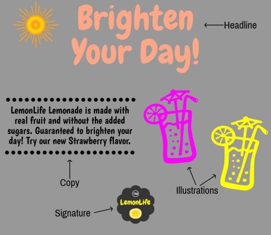
Users: The users are high school sophomores, juniors, and seniors, ages 15-18 that should all be at, or about at grade reading level. Students will have most likely heard of the terms headline, copy, illustration, and signature, but most likely not in the context of advertising.

Why Will These Work?:  I could easily relate to this chapter about white space because I teach about it in my marketing class! White space is used to “divide text and graphics.” (Lohr, 2008, pg. 272). According to the Marketing Essentials textbook, an advertisement “should make a generous use of white or unused space for a clean look.” It also “helps to make the copy legible and creates an “eye flow” for the ad” (Farese, Kimbrell, & Woloszyk, 2012, pg. 478). For my graphic, I decided to created a print advertisement that shows good use of white space. I chose to use an asymmetrical balance which means that “the elements appear to be off balance…which tends to create more visual interest” (Lohr, 2008, pg. 275). I also added in the four different elements of a print ad with arrows showing each part. If I were actually teaching this in class, I would point out the white space and how it makes the ad look well organized and gives it a clean look, directing the customers to through the text and illustrations.

User Test/Changes:  Originally, I did not have the dotted lines above and below the copy and the background was a darker gray. After the user test, my friend suggested that I add something around the copy text to make it look better visually. She also suggested a lighter gray for the background for better contrast. All changes have been updated, please let me know if you have any further feedback.

References:

Farese, L.S., Kimbrell, G., & Woloszyk C.A. (2012). Marketing essentials. New York, NY: Glencoe/McGraw-Hill.

Lohr, L. (2008). Creating graphics for learning and performance (2nd ed.).  Upper Saddle River, NJ: Pearson Education.


EdTech 506: Organization

Gilin Organization

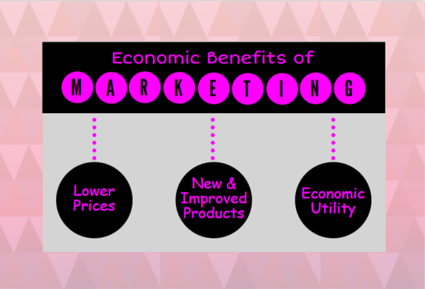
Users: The users are high school sophomores, juniors, and seniors, ages 15-18 that should all be at, or about at grade reading level. Students will have most likely heard of “lower prices” and “new and improved products,” but probably have not heard of “economic utility” at this time.

Why Will These Work?: This image was created to help students understand the 3 economic benefits of marketing. Ch. 6 helped me better understand organization through hierarchy. I wanted to organize the information using shapes and cues – which are “a form of hierarchy that uses visuals such as arrows, headings, and lines in instructional materials” (Lohr, 2008, pg. 123). I wanted to be a little more creative than using arrows and lines so I used dotted lines to direct the learner to each economic benefit of utility. I also wanted to create a direction of the students’ eye when reading the graphic. “By placing important information onto a horizontal or vertical alignment, it is more likely to be noticed” (Lohr, 2008, pg. 128). I worked to accomplish this by placing the most important information at the top and then include the three benefits below. The user will use the vertical and horizontal alignment to direct their eye, top, then left to right. I used figure 6-4 on page 129 for inspiration. I tried to incorporate some nice colors and use of shapes as well and really enjoyed this assignment!

User Test/Changes: Originally, I did not have the black box around the “Economic Benefits of Marketing” title. After the user test, my friend mentioned that I should ad this in to make the groupings and hierarchy clearer. I really like the added contrast between the black and pink as well. She also suggested that I make the dotted lines thicker as they were smaller and had more dots that were not as easy to see. Finally, I ended up changing the fonts in each circle, because I felt it was blurry and looked a little hard to read. All changes have been updated and I am really pleased with the final visual! Please let me know if you have any further feedback.

References:

Lohr, L. (2008). Creating graphics for learning and performance (2nd ed.).  Upper Saddle River, NJ: Pearson Education.

EdTech 506: Color & Depth

Gilin Color

Users: The users are high school sophomores, juniors, and seniors, ages 15-18 that should all be at, or about at grade reading level. Students have been studying the definition of marketing all year and should be familiar with most terms within the definition.

Why Will These Work?: For this assignment, I wanted to create a visual that clearly states the definition of marketing, but also provided images to help students learn and understand. The definition is broken down into three parts with corresponding images. Color is defined as “a tool of instruction that can make or break the appearance and effectiveness of a document or image” (Lohr, 2008, pg. 264). I used a grey background to provide contrast to the images and text. For the text, a primary color (blue), complimentary colors (blue and orange), and secondary colors (orange and purple) were used. Depth was utilized by having the main background blue and layering black before the grey. My goal was to create a frame-like visual for the definition to “make the information stand out” (Lohr, 2008, pg. 270). I believe this was accomplished!

User Test/Changes: Originally, I did not have the images and the graphic was not as visually pleasing. It looked incomplete with just the definition broken into parts. I also had the text and visuals closer together which made it look too crowded. This was all feedback from the user test. I found several helpful images to describe each part of the definition and spaced it out better, making it look more organized and effective. The above image is the updated version. I feel as though this image will help students not only learn, but actually understand the meaning of marketing.

References:

Lohr, L. (2008). Creating graphics for learning and performance (2nd ed.).  Upper Saddle River, NJ: Pearson Education.

EdTech 506: Selection Project

Gilin Selection Project

Users: The users are high school sophomores, juniors, and seniors, ages 15-18 that should all be at, or about at grade reading level. Students have most likely heard of the words “form” and “utility,” but probably not in the context in terms of marketing.

Why Will These Work?: After reading Chapter 5, I tried to focus on three of the characteristics to “create an effective instructional visual: concentrated, concise, and concrete” (Lohr, 2008, pg. 102). The graphic is concentrated because there are key visual points, such as the fabric, thread, and button, and a key text point, the word “form” that are emphasized (Lohr, 2008, pg. 102). I made the visual concise by keeping it as simple as possible. It is concrete because the message is meaningful to represent one of the five economic utilities. In addition, I changed the background to a light grey and added in black boxes/bubbles to add contrast. I changed the opacity of the shirt to make it look lighter so that each aspect that makes up the shirt was the main focus.

User Test/Changes: Originally, I had a different font for the form utility definition. I also did not have the black background boxes behind the title and definition. After the user test, she suggested that I change the font so that it was easier to read, and also add some contrasting boxes to add to the parts of the shirt theme and make the title/text look more organized. The above image is the updated version.

References:

Lohr, L. (2008). Creating graphics for learning and performance (2nd ed.).  Upper Saddle River, NJ: Pearson Education.

EdTech 506: CARP Project

Gilin CARP

Users: The users are high school sophomores, juniors, and seniors, ages 15-18 that should all be at, or about at grade reading level. It is likely that most, if not all of these terms will be new to students.

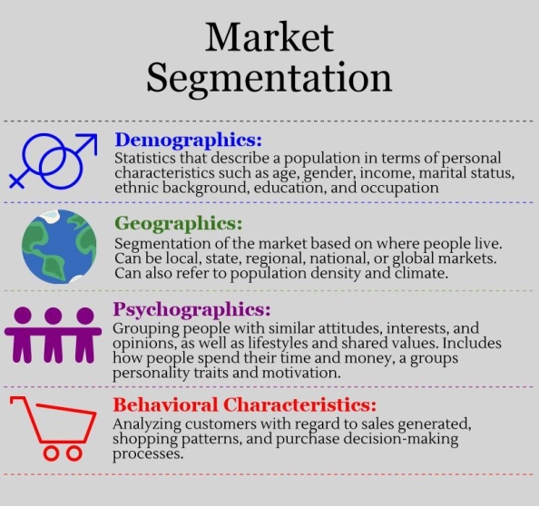
Why Will These Work?: In this week’s reading, CARP was discussed in further detail. CARP stands for Contrast, Alignment, Repetition, and Proximity. For my graphic, I created a visual of the four ways that markets are segmented.

Contrast: Contrast can be utilized “by establishing differences between elements in a visual” (Lohr, 2008, pg. 200). Contrast was used a few times in this visual. I coordinated the color of each way to segment, grouping them with each corresponding graphic and changing the color to match. In addition, I used contrast by making the font bold for the type of segmentation and not for the explanation.

Alignment: The graphics, type of segmentation, and explanations are left-aligned for “easier reading” (Lohr, 2008, pg. 201). It makes the graphic look well-organized and consistent.

Repetition: I was consistent by choosing one graphic to describe each type of segmentation, used dashed lines to separate each type, and used the same fonts. The box is repeated for each type of segmentation.

Proximity: I used proximity to show how each graphic is related to the type of segmentation and explanation within the each box. Each box has some space in between to show that they are all related to the concept of market segmentation.

User Test/Changes: Originally, I had graphics on both sides of the text. My friend said that it made the image too crowded and seemed a bit overwhelming. The updated image is simple, yet hopefully effective. It also is not as confusing. By having the pictures aligned-left with the text, your eye goes directly to the graphics and then right into reading the text.

References:

Lohr, L. (2008). Creating graphics for learning and performance (2nd ed.).  Upper Saddle River, NJ: Pearson Education.

EdTech 506: Design Model

Gilin Design Model

Users: The users are high school sophomores, juniors, and seniors, ages 15-18 that should all be at, or about at grade reading level. Some of these terms, such as promotion, selling, pricing, and marketing will be words that students have heard and used before. The terms marketing information management, channel management, market planning, and product/service management will probably be terms that are new to students.

Why Will These Work?: When reading this section, I really focused on using the ACE model as guidance. ACE stands for analyze, create, and evaluate (Lohr, 2008, pg. 73). The graphic that I chose to create represents the 7 Core Functions of Marketing that include Marketing Information Management, Channel Management, Promotion, Selling, Pricing, Market Planning, and Product Service Management (Farese, Kimbrell, & Woloszyk, 2012, pp 8-9). I began by analyzing the 7 functions that make up marketing and brainstormed an analogy to compare them to. Analyzing really helped me to “identify the purpose of the instructional visual” and I began with the end in mind (Lohr, 2008, pg. 75). I concluded that 7 functions of marketing are like an umbrella. All are a necessary parts to make up marketing as a whole. If a function is missing, the marketing process will not work properly, just as if a part of an umbrella is broken or there is a hole in the canopy, it will not keep rain out. When creating this graphic, I wanted to make it simple, yet effective. I also wanted it to be more unique than the average graphic organizer. I decided to break the umbrella canopy into 7 sections to represent the 7 functions of marketing. Each section is a different color to represent that each part is its own function and uniquely relates to marketing as a whole.

I used the vector tool to free form draw each section, copied and pasted and then transformed, flipping horizontally so that it was identical on the opposite side. In addition, I used the text tool and drew lines that allowed me to attach the text to the path drawn so that it would align inside the umbrella (Lohr, 2008, pg. 84).

User Test: I had my friend look at the original visual (which didn’t have the word marketing on the handle). The word marketing was originally on top of the umbrella canopy. After the user test, my friend mentioned that placing the word on top of the umbrella made it look like I was trying to protect the functions from the word marketing (as an umbrella protects a person from the rain). This was definitely not my intention.

Changes: During the evaluation portion, I made changes to the image to clearly display that marketing is connected to the 7 functions, not against them. I had the idea to make the word a part of the handle. This displays that the 7 functions make up marketing and without marketing, the 7 functions are nothing more than independent terms. This goes back to my umbrella analogy. If the is no handle and nothing to hold the umbrella together, it loses its function.

References:

Farese, L.S., Kimbrell, G., & Woloszyk C.A. (2012). Marketing essentials. New York, NY: Glencoe/McGraw-Hill.

Lohr, L. (2008). Creating graphics for learning and performance (2nd ed.).  Upper Saddle River, NJ: Pearson Education.

EdTech 506: Shape Tools

Gilin Shape
Users:
The users are high school sophomores, juniors, and seniors, ages 15-18 that should all be at, or about at grade reading level. A majority of students will have heard of all of these words before, but perhaps not in the context as related to marketing.

Why Will These Work?: For my 4 P’s of marketing visual, I created images using different colors and shapes to help focus the attention on these 4 aspects (Lohr, 2008, pg. 252). In addition, I added arrows to provide direction to display the relationship between the 4 P’s and the target market (Lohr, 2008, pg. 254). All 4 of the P’s should be directed at the target market in order to be successful. The target market is the intended buyers of the product. Product includes what the company is trying to sell, place refers to where the product is sold, price is how much it costs, and promotion is how the company advertises or promotes the product (Farese, Kimbrell, & Woloszyk, 2012, pp 20-23).

For these images, I used a combination of lines and shapes. More specifically, circles, rectangles, arrows, the doughnut and beveled rectangle shapes. I added color to make each look more realistic and stand out to the user.

User Test: I had my friend look at the original visual (which didn’t have the arrows). She suggested to add in the arrows so that there would be a unified direction, displaying how the 4 P’s are related to the target market.

Changes: I made the changes to the image by adding in 4 arrows, coming from each P of marketing. Before, the images were just shown as 4 different parts, but it was not clearly displayed how each related to the target market. This simple change really added to the image and shows that each is important and should be aligned to the target market.

References:

Farese, L.S., Kimbrell, G., & Woloszyk C.A. (2012). Marketing essentials. New York, NY: Glencoe/McGraw-Hill.

Lohr, L. (2008). Creating graphics for learning and performance (2nd ed.).  Upper Saddle River, NJ: Pearson Education.